It’s a cliché, but we eat with our eyes – how our plates have changed.
1970s
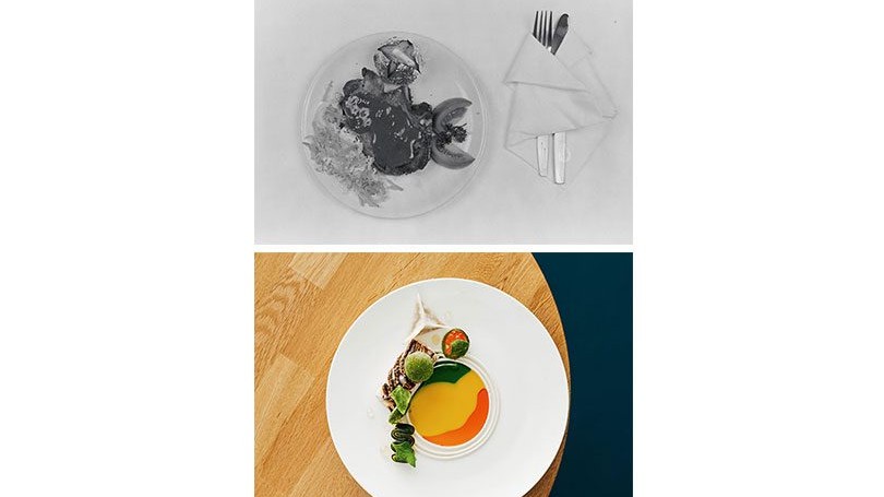
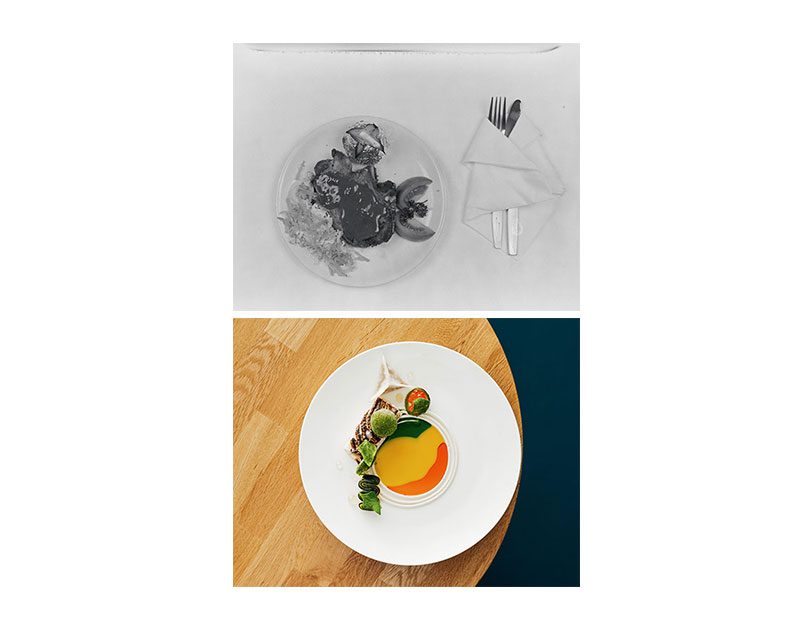
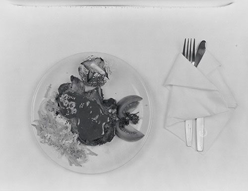
Opened in 1972 on Wellington’s Plimmer Steps, The Woolshed stood out among Wellington’s expensively exclusive restaurants with its ‘authentic woolshed atmosphere’, described by Designscape magazine as ‘slightly whimsical but nonetheless honest to the point of naivety’. As one of the capital’s first family restaurants, it deliberately targeted a younger clientele delivering a more casual vibe rather than fine dining. So, gone were the starched tablecloths, silver service and intimidating maitre d’, in favour of tables styled as sheep pens, sheepskin-covered seats, stone crocks and fence-post salt and pepper shakers. The food, too, was unpretentious, drawing from a classic steakhouse menu of omelettes, burgers, steaks, lamb chops, curry and deep-fried fish. It wasn’t just the surroundings and the menu that radiated the casual mood, even the way the food was presented had a relaxed, unfussy feel, with most dishes accompanied by a tangle of coleslaw, simply sliced tomato untroubled by a dressing and a foil-wrapped baked spud. Echoes of the past remain though, with the meat plated smack in the centre and sauce spooned over (no swirls, drizzles or dots here), the ubiquitous parsley garnish and silverware swaddled in a stiffly folded napkin. But there was more going on than just looks: in the 1970s ingredients, techniques and styles were shifting rapidly and then, as now, astute plating was a way for chefs to showcase these and reinforce the restaurant’s brand – all of these adding value to the dining experience and dollars to the bill.
2021
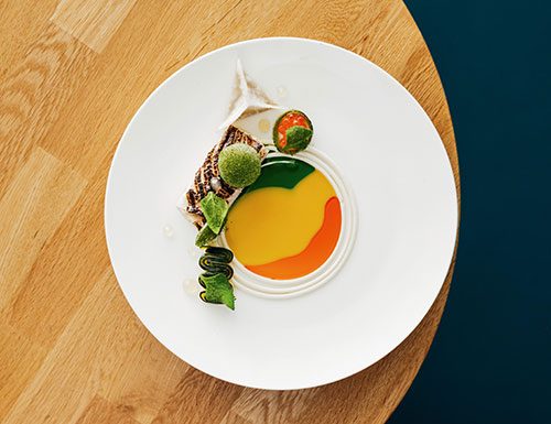
In our social media age, the optics have become an essential tool to create excitement and drama, and ensure dishes are photographed and shared, a highly effective way of getting restaurants noticed. A deftly presented dish honours the skill of the chef, allowing them to stamp their identity on the plate, allude to the quality of the ingredients and the high degree of care coming from the kitchen. This dish from Paris Butter presents torched snapper, soy dashi, crayfish oil, green tomato and kohlrabi. Chef Nick Honeyman says, “It is taste we always focus on first, but we put an equal amount of effort into presenting our food once we are happy with the flavours. I love circular lines and the outlines of objects. I have always been fascinated by looking at objects and spaces and noticing an almost stencilled out black line around shapes created by shadow. We also wanted to create something that looked the same on the pass as it does when it arrives at the table and unless we pour all sauces tableside it was virtually impossible. So, we took our composed dish and split it out in a perfect circle which would come together again when the guest starts to eat it.” But he says, it’s just a perfect piece of fish with garnish and a sauce. “Presentation is something that is ever evolving, but the basics are all still the same. In cooking nothing has changed.” TRACY WHITMEY
SEE MORE FROM CUISINE
Design File / Sara Bruce / Exhibit A / Auckland
The contents in a cold glass should be savoured. Having one superb…
When only the very best will do
How Bocuse d’Or Team New Zealand will meet the highest standards at…

